Business accounts
Helping business make international transactions
TLDR;
After seeing growth plateau, Transacti* needed to expand their market to reach new user bases . After analyzing transaction data, we identified a significant opportunity: 20% of users were using the app to conduct business overseas. To address this, we introduced business accounts, offering tailored features like business verification, adding businesses as contacts, and exclusive rates based on larger transaction sizes. The new business account type projected $20M in ARR and promised consistent and predictable use of our product.
*Company name changed


Transacti experienced a plateau in user growth one year after its initial launch. The goal was to expand the user base and increase transaction frequency by targeting small businesses and manufacturers.

Hypothesis
If we can convert small businesses and manufacturers to our product, they would use it at regular and predictable intervals.
Through competitor analysis, we identified gaps in the market, such as limited flexibility, weak onboarding, and a lack of integration. We positioned the product as client-focused, flexible, and capable of handling multi-currency transactions, while addressing weaknesses like limited functionality and brand recognition.
We scoped the project to design and develop an MVP in two months, focusing on:
Business Account Creation
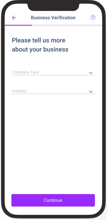
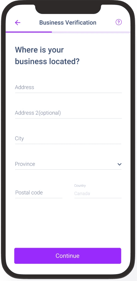
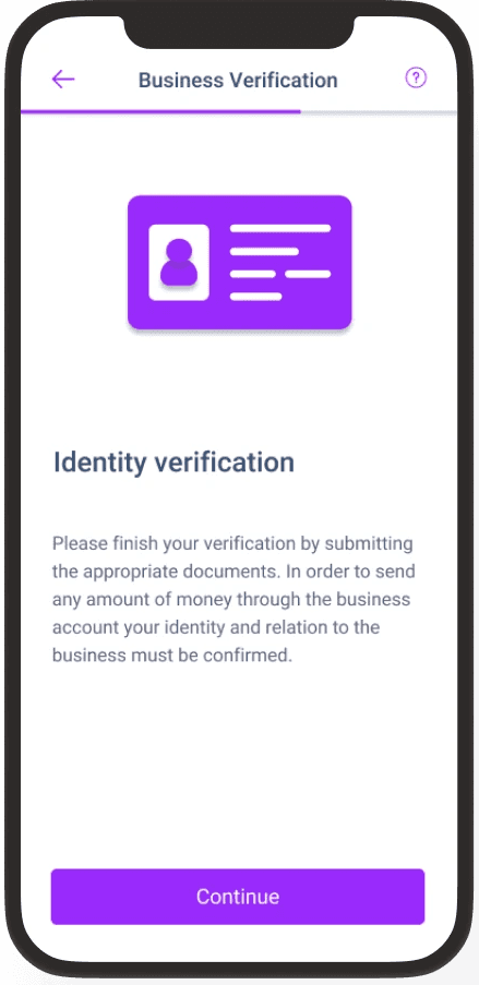
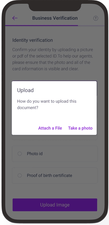
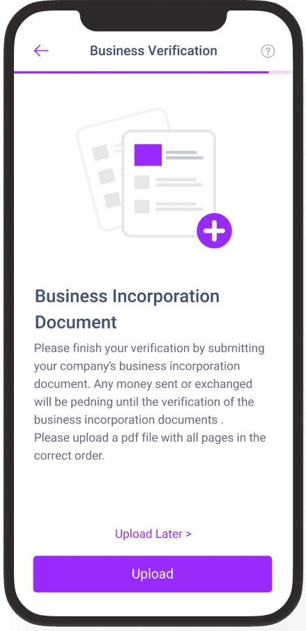
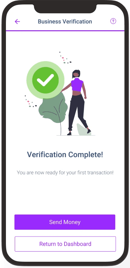
Business Verification

Reducing Friction in Sign-Up
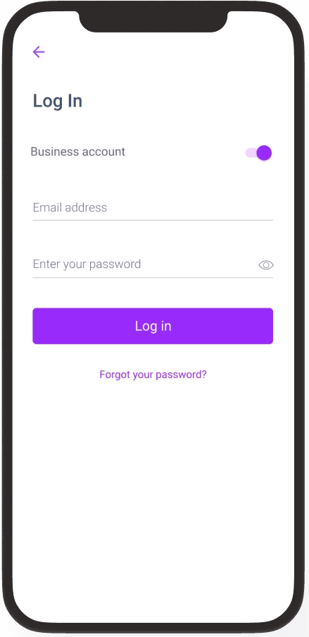
For the sign-up process, our primary concern was whether or not user would select the right flow: they had the option to sign up or login as either a personal account or a business account.
Design A

Design B

Research revealed users preferred:
Toggle design over radio buttons for selecting personal vs. business accounts due to its clarity.
A launch page with clear login/signup buttons to streamline navigation.
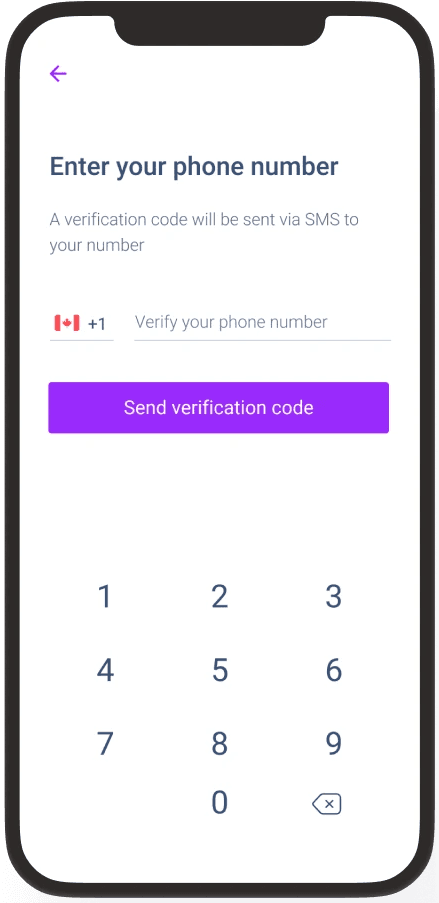
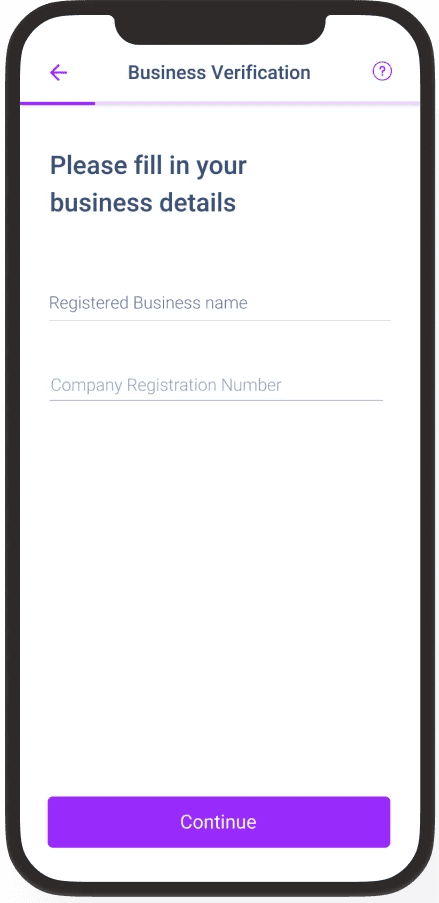
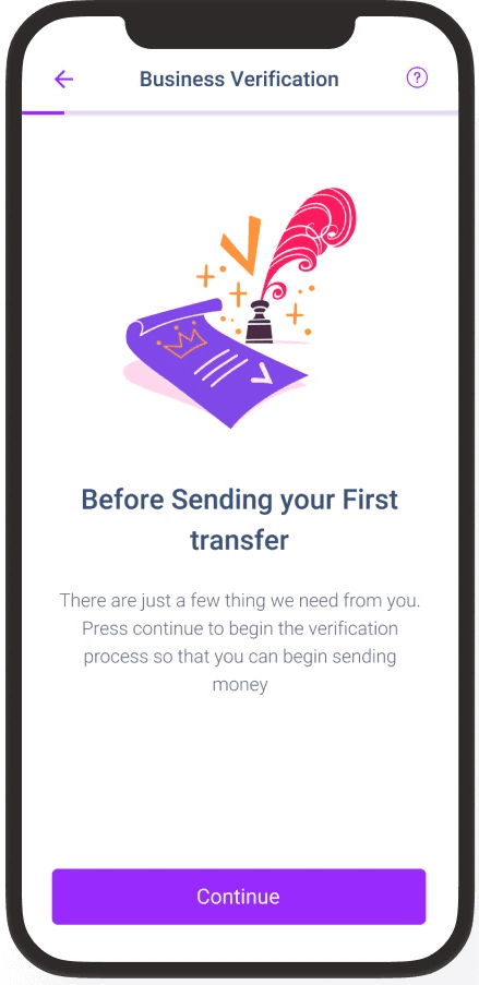
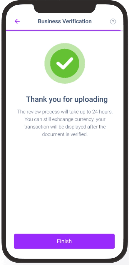
Preventing Drop-Offs during validation
The validation process before a user can conduct their first money transfer is long. I wanted to learn how the users would prefer the information be split, and if giving the option to enter the information later would prolong the user's first transaction or if the flexibility of doing the process in parts would make them
Design A

Design B

Research revealed:
Breaking the process into clear steps reduced errors and made it easier to complete.
Giving users the option to skip document uploads for later kept them moving forward.
A multi-step flow helped prevent drop-offs by making the process feel less overwhelming.
Unfortunately when working as an intern, it isn't always possible to be there for a project until the end.
The timeline for the getting the designs of the project complete took me right up until the end of my internship so I wasn't able to be there for the product launch. I did however leave a list of metrics that I would have used to validate the success of the design and how to gather them.
They were as follows:
Track recurring payments and transaction sizes and compare them to the values for personal accounts so that we could validate our initial hypothesis
Analyze user behaviour using HotJar replays to see if there were any points of friction that we had missed
Conduct A/B testing on for the verification process on a launched version of the product to see which resulted in faster time to initial transaction
Looking back, I wish I was more more cognizant of accessibility issues in the product